The video we watched in class yesterday, which was about a young woman and her family’s experience after she got caught up in sex trafficking, really showed me how creative you can get with video even in a journalistic setting.
Animation sequence from HP7.
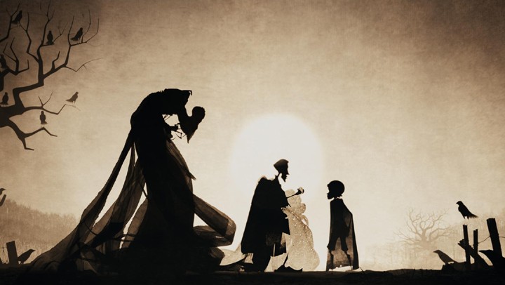
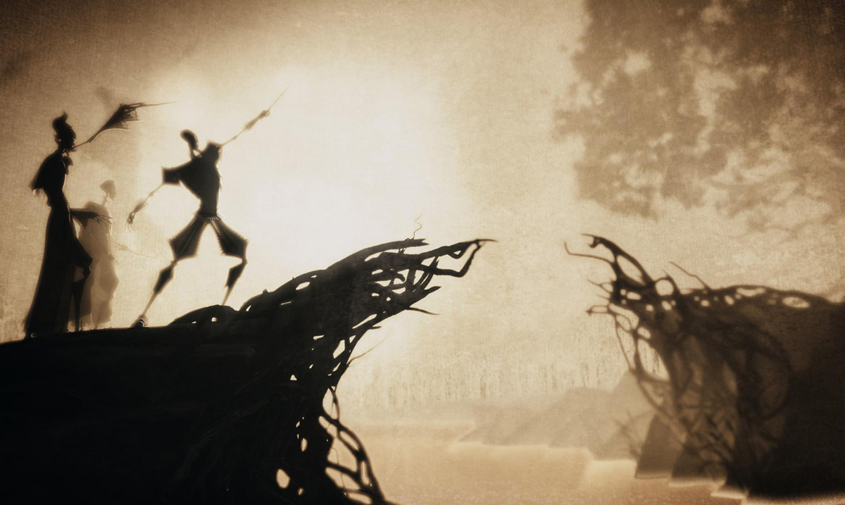
In particular, the animation used to tell the young girl’s story (which clearly was not captured on video) really resonated with me. It reminded me a lot of the animation sequence used in one of the last Harry Potter movies…honestly it could even be the same director or artist.
Animation sequence from HP7.
I think it’s a genius idea on how to recite a story without hiring actors or others to reenact it, which connects with viewers on a much less effective scale. The dark figures, which are also in the video, represent the darkness that occurred during the terrifying four days that the girl was separated from her home.
I have always considered myself a creative/artistic person , and therefore it’s a challenge sometimes to keep my mind in a “journalistic” mode. This video gave me hope that I could find a career doing something artistic or innovative, but still in journalism, which inspires me but leaves out some of my true passions. I can’t find the video to embed in this post right now, but I wanted to write about it since the directing intrigued me.
Here are my answers to the questions found here, mainly based on the article “Multimedia Ethics” by Donald. R. Winslow.
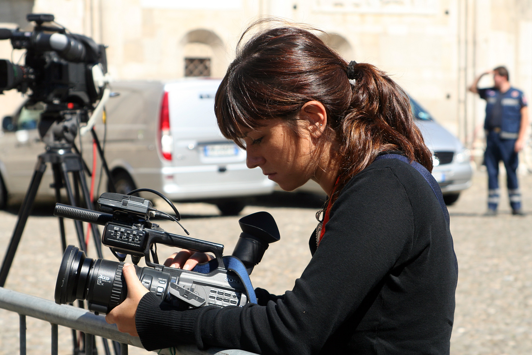
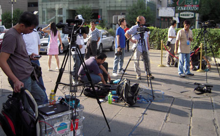
Videojournalist.
What are the new ethical challenges with multimedia/ video-journalism?
According to the reading, one of the new ethical challenges with video journalism is that as a reporter, you have to be sure you are “capturing” reality instead of designing it yourself. Video includes moving images and audio, and the editing process allows one to cut and paste segments of time together that could ultimately tell a different story than what truly took place. There’s also the question of what should you get footage of v. what can you get footage of, and guidelines for this question most likely change from organization to organization.
Why are ethics and credibility issues in journalism important?
Ethics and credibility are important in journalism for many vital reasons, the first and most crucial of which is making sure that the general public regards you as a trustworthy source of information. Without journalists or the media – no matter how flawed their systems are – the public would be ignorant to countless events regarding politics, social issues, crime and more. Without ethics and credibility in place in the media, the public would have no main outlet of truth, which could lead to more conflict and confusion throughout the entire country. It’s also important that each or most journalistic businesses agree on general ethical standards, such as the code of ethics presented by the Society of Professional Journalists, so that the information can be checked and agreed upon across multiple sources.
What drives a video piece according to Leeson?
According to Leeson, audio drives a video piece. He notes that it’s easy to cut and paste piece of a video together and change a story altogether, urging journalists to make sure that if they’re cutting audio out, that the story still represents the full and accurate truth.
What does Leeson say about asking subjects to reenact an action, sequences, audio clips, and hums and ahhs?
Leeson says, “Do not ask a subject to perform an act or repeat an action unless for illustrative or demonstrative purposes such as in a ‘how to’ video.” He also says that editing out “hmm”s or “ahh”s could be unethical if that it how the subject naturally speaks during an interview. As journalists we want to present the truth.
What are some of the points that Jorge Sanhuela-Lyon makes on the ethics of multimedia?
Sanhueza-Lyon notes that there are endless ways to manipulate a video, especially if it’s not edited according to some format, such as broadcast. He brings up how it’s easy to do little unethical things, like recording ambient audio on a different day then the actual interview, but still putting the ambient sound in the background. Video storytelling allows for endless tiny edits that can alter the original tone of a story.
What are some of the differences between broadcast and multimedia web video?
Broadcast video is different from web video in that it has a limited time frame and it is made according to some pre-approved template or pattern. On the web, a person has nearly unlimited options on how long they want to make a video, unlimited options on how they can portray it in terms of directing and editing and unlimited options for the content of their story.
How does the online audience know if a multimedia piece on the web was done ethically?
An online audience can tell if a multimedia piece was done ethically by paying attention to where the cuts and edits are of a particular video clip. If there are no cuts, such as a raw footage of a natural disaster or fire, it is easy to tell. If there are clear breaks between an interview and you can tell the subject seems to move from one topic to the next in a non-realistic chronological order, it may have been edited unethically. The more you shoot video, the easier it is to notice these minuscule nuances in edited video.
Is journalism dead?
According to Sanhueza-Lyon, journalism is not dead. He thinks the type of journalism that occurred before the Internet and citizen journalists may be on the sharp decline, as he doesn’t see newsrooms with typewriters and “scotch in the drawer,” but “storytelling is more alive now than ever.” With more opportunities and technology to get the job done, more people than ever are producing journalistic products, especially utilizing multimedia tools. Personally, I agree with him. The Internet has also made it dramatically easier to find and share information.
What ethical problems can the 24 hour news cycle bring to journalism?
According to Rich Beckman, one of the main issues that goes with a 24-hour news cycle is the pressure on media outlets to break the story first. This pressure is highly increased by the commercialization of journalism. Also, the fact that ordinary people are generating online content, and even posting breaking news stories, heightens the chance for a news source to pick up a story that is actually inaccurate at the risk of being the first one to get the scoop. Beckman says that being accurate is much more important than being first.
Is having less editors an issue? Why?
Yes, Beckman says. It’s a problem because with less editors, there are less people that a story goes through first before being published, which raises the chance of publishing misinformation. Editors are also the ones, according to Steve Raymer, that exercise judgment over a piece’s values or ethics before making the final decision to publish. Without a line of editors, a story has a greater chance of being unethical and published for hundreds of thousands of eyes to see.
What should the standards for video-journalism be? Make a list.
The standards for video-journalism according to this reading (and my own personal judgment) should be:
Edit with a careful eye as to preserve a story’s original tone and tale.
Don’t use audio or video from separate moments in time together with audio or video from the main reported story/event.
Make sure the footage you are publishing will not do more harm than good.
Be sure your story is accurate before publishing it, even if it means you will not be the first to report it.
Represent your subject’s true character to the best possible ability – don’t cut out “um”s or other transitions if it is a part of their natural speech.
Put your story through to an editor before making the final decision to publish it.
Do not ask a subject to perform a certain act or reenact something from the immediate past – just portray what is there.
Know what is news and what is not; what does the public have a right to know?
The video I described below is a perfect example of an effective video story, but this video, Chapter One of a series by PBS “Poisoned Waters” or “Imperiled Chesapeake Bay,” shows how the same effective storytelling can be applied in a journalistic sense.
It’s part of a larger documentary on how the way humans live is dramatically affecting our largest neighboring ecosystem: the ocean. Not only is the ocean full of vital natural resources, but it is home to nearly one million species of living creatures; creatures that are innocent of any reason for us to be killing them.
The narrative voice certainly provides the viewer with facts such as a news article would, but the imagery really allows one to see the impact that humans are having on more than 4/5 of the earth’s surface. The videographers went to great places and great lengths to acquire these moving images, and for a purpose. This story truly shows what is happening to part of our world’s diverse ecosystems in Chesapeake Bay, which is reminiscent of what is happening to many other bodies of water.
The video makes sure to give enough facts and statistics to remain objective, yet there are few conclusions to draw.
Donna Ferrato – Mary left her abuser to live in a shelter with her daughters. She returned to school and began to work with the children of addicts. Minnesota, 1988.
For me, Donna Ferrato’s photo series “Living With the Enemy” is one of the most inspiring large-scale photojournalism projects I have ever seen and/or read about. Ferrato captures moments of domestic abuse in these images, as well as the after effects of emotions, physical wounds and legal justice. I chose to include the image on the left because it conveys to me what Ferrato’s photo story has helped more women do: leave their abusive partners in search for a safer, better life. I think this is such a sensitive topic, and some of the images are graphic, but they are the truth; they are what happens to thousands of women every day, probably more. Being able to publish these images has led to changes for not only women in domestic violence situations, but for other people in law enforcement and communities interested in taking collective action against these awful crimes. If she had just documented these individual’s stories through text, it probably wouldn’t have made as large of an impact on as many people as it did (although for me, it would have been just as powerful). It’s the sad truth that many people just need to physically see something before they can empathize and understand what is happening. It must have taken a lot of courage and determination to capture these photos, and it’s admirable.
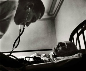
‘Country Doctor’ was an instant classic when first published in LIFE in 1948, establishing W. Eugene Smith as a master of the photo essay.
The other photo story we were told to research is W. Eugene Smith’s “Country Doctor.” Although older and somewhat different than Ferrato’s photo story, Smith’s story still had a powerful impression on me. I chose to display the image on the left because it shows one of the two most important things I think of when I imagine a rural, small-town traveling doctor: attending to the elderly and helping women go through labor. I think this image in particular conveys the intimacy of the patient-doctor relationship that Dr. Ernest Ceriani (the country doctor) had with every single one of his patients. The trusting gaze of the elderly man as Dr. Ceriani does his job is very well-captured in this photograph.
It’s interesting to me how one of these photo essays documents a wide-impact social and political issue, while the other simply captures the essence of the life of an individual man. From these two stories, one can see the diversity of ways that photojournalism can operate, and imagine that there are hundreds of thousands of categories in between the two. Overall very inspiring.
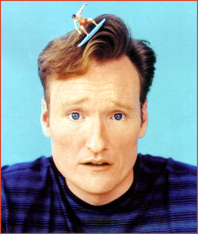
This portrait of comedian Conan O’Brien made an impression on me because of the striking color, emotion and humor it brings to the viewer. When looking at this image, I notice several things right off the bat: Conan’s bright blue eyes, his ridiculous demeanor and the fact that there is a toy surfer riding the giant wave of his hair. It’s fun, it’s different and it shows that Conan isn’t afraid to poke some fun at himself; something that definitely humanizes him for his audience.
This article on lightstalking.com discusses “How to capture portraits that are more than just snapshots.” One thing it mentions that I would have failed to think of is the importance of making a personal connection with your subject during a photo shoot; something that the photographer of Conan O’Brien’s portrait above would clearly had to have done – at least on a small scale – before taking that shot.
I really like this article because it touches on a lot of technical approaches you can utilize to enhance the quality of portrait shots, such as shooting in aperture priority mode instead of full manual to make things a little easier on yourself during a shoot, noting that you can always boost the ISO if necessary to avoid blur. These tips are very useful for an amateur photographer like myself, who doesn’t feel comfortable enough to quickly fumble around with the camera’s functions during a photo shoot.
They also suggest some things to make shots more creative, like using non-traditional focal lengths, slightly over-exposing an image or introducing a prop, like Conan’s photographer (or perhaps Conan himself) chose to do above. It is these little hints of creativity that can truly enhance a portrait and make it stand apart from others, but making the subject feel at ease comes first.
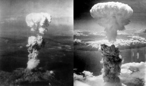
The first historical photo I chose to analyze has always had an effect on me. Nearly anyone who sees this image will know the tragedy it is depicting: the U.S.’s decision to drop atomic bombs in Hiroshima and Nagasaki near the end of WWII, when it became a reality.
U.S. – initiated atomic bombs form mushroom clouds over Hiroshima (left) and Nagasaki (right) near the end of WWII.
The image leaves an impression on me because I’ve always been against violence, for no reason more than an intrinsic feeling that it is wrong. I am so far from having violent tendencies that I cannot even understand hurting a single human being, let alone the hundreds of thousands that died in Japan – all from our nation’s decision to use these man-made weapons. In fact, the bombs killed so many people that the body-count estimates have a margin of error of more than 50,000.
War already impacts ordinary people on an unacceptable scale, and this is one of the most extreme examples of where innocent people die from human conflict, which is largely due to miscommunication. We are all humans, and honestly, even though Japan attacked Pearl Harbor, I see this decision as unjustified. There’s a reason no one has used such a deadly weapon since this moment. The photo is powerful not only in the memories it evokes, but the visuals show how high and wide the smoke spread. Even though cameras in 1945 were not the quality they are now, they were able to capture these photos with amazing detail and perspective, also contributing to our visual historical record.
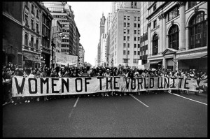
Women join forces to protest during the Women’s Rights Movement of the 1960s.
The second iconic photo I chose is on a bit of a less-serious scale. Although it was also was taken before I was born, I will always remember it. This is because it reminds me of how active, persevered and united 50 percent of the U.S. population had to become just to gain equal rights in the workplace, and elsewhere. The perspective of the photo, as the photographer is at somewhat of a distance, shows the mass scale of this protest, which many others of its kind matched throughout the 1960s. It even employs several creative devices, such as vanishing point, action and emotion.
Also, the “Women of the World Unite” sign is able to serve as the picture’s caption, even though it’s within the image itself – making it even easier for viewers to recognize what is happening, no matter how far removed in time, space or knowledge they are from the situation. What these women did eventually got the recognition it deserved, and it benefited every single woman that would exist in the future, such as myself.
Each of the images below illustrate the use of multiple photographic devices, which led The Washington Post (image 1), The New York Times (images 2 and 4) and The Associated Press (image 3) to select them as some of the best images of 2014. For each photo, I will analyze and describe what mechanisms I believe the photographers were able to capture. To see an image’s original source, click on the photograph.
Image by Amanda Voisard, The Washington Post. A bird takes flight as the sun rises over Arlington National Cemetery in Section 60 on May 22. Hundreds of Iraq and Afghanistan war dead are buried in the section.
For this shot, I recognize several creative devices, including selective focus on the right-hand side/bottom, dominant foreground/contributing background, the rule of thirds and diagonal lines, which are formed by tombstones’ alignment. Together, these elements form a very professional aesthetic.
Jan. 22, 2014, Denver, Colorado. Photo by Ed Kashi for The New York Times. A worker cures marijuana at a dispensary and grow house. In January 2014, Colorado legalized the sale of recreational marijuana.
This image is clearly interesting whether one has knowledge on photographic creative devices or not, but the components that I sense make the picture so good are texture, details, an unusual perspective, layering, the rule of thirds and interestingly, the two separate C-curves being shaped by the colorful tags.
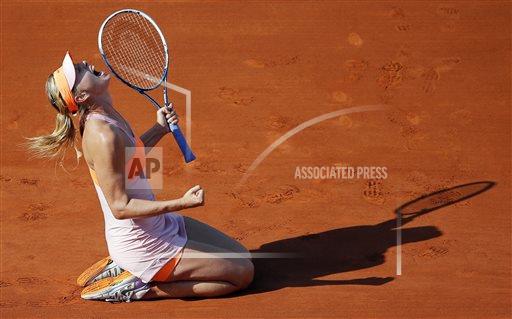
Photo by David Vincent for The Associated Press, June 7, 2014. Russia’s Maria Sharapova reacts after defeating Romania’s Simona Halep during their final match of the French Open tennis tournament at the Roland Garros stadium, in Paris, France, Saturday, June 7, 2014. Sharapova won 6-4, 6-7, 6-4.
In this photograph, I detect various devices in use, such as strong emotion, rule of thirds, action, an S-curve formed by Maria Sharapova’s body and detailed texture, seen in the wrinkles of her clothes, the texture of the court and her muscles. Also, I was personally very attracted to the overall color scheme.
Photo by Andrea Mohin for The New York Times, Jan. 24, 2014. The New York City Ballet dancers Emily Kikta and Meaghan Dutton-O’Hara look for themselves in a photo installation by the street artist JR at Lincoln Center.
This lively photo exemplifies many creative devices, but the first that caught my eye were (once again) the rule of thirds, introducing color into a monochromatic scheme, patterns, texture and C-curves.
As this article suggests, blogging is not only good for improving your writing skills and online image, but it may even have therapeutic benefits.
“Besides serving as a stress-coping mechanism,” the article states, “research shows that [writing] improves memory and sleep, boosts immune cell activity and reduces viral load in AIDS patients, and even speeds healing after surgery.”
The piece further references a study that revealed cancer patients felt healthier overall when they engaged in expressive writing, even before treatment.
Researchers are also interested in identifying the cluster of neurological pathways that writing is thought to activate in the human brain. So clearly, writing can do much more for humans than convey messages or serve as an easier form of communication.
Multimedia journalism incorporates many various elements, and I’ve already learned a bit more about the web after the first three classes. For example, I never truly understood what RSS feeds or FTP (file transfer protocol) were, but now I feel I have a much better grasp on the concepts.
This is specifically helpful for me, because at my internship I am constantly posting and editing pages on The Ohio State University College of Veterinary Medicine’s website. For this reason (and from taking comm 2511), I’ve had a bit of experience with some of these concepts in web design, such as HTML and some rules about aesthetics in designing a web page or article.